Ever spent hours hunting for the perfect UI kit, only to find a flashy demo that falls apart in real projects? I’ve been there. That disappointment is real. You want professional components that actually work, not just look good in a sales pitch.
That’s why I bought Untitled UI with my own money. I’ve used it across multiple client projects for startups and SaaS companies. This massive Figma kit and its new React library finally bridge the gap between design and development.
This Untitled UI Review is my honest take after putting it through its paces. We’ll explore its enormous component collection, professional design quality, and whether it’s worth your investment. Let’s see if this is the solution you’ve been searching for.
Key Takeaways: Untitled UI Review
- Addresses the common frustration of UI kits that look great but lack real-world usability.
- Functions as a dual solution with both a Figma design system and a React component library.
- Review is based on hands-on, paid experience with the product across various projects.
- Stands out due to its massive scale of components and active maintenance with updates.
- Primarily tailored for designers and developers working on startups, SaaS, and tech projects.
- The newer React library extends the product’s value directly into the development workflow.
- This analysis will help you determine if it matches your specific design and development needs.
Untitled UI Review: An Overview
Introduction to Untitled UI
Today’s design workflow demands speed without sacrificing quality – a challenge that’s reshaping the entire industry. AI tools promise efficiency, but they often lack the consistency that professional projects require. That’s where comprehensive design system solutions become essential.
Overview of the AI and Design Landscape
Modern web design has evolved dramatically. Teams need kits that work across different platforms and scale with their projects. The gap between rapid prototyping and production-ready components is exactly what this product addresses.
I’ve watched the landscape shift toward systematic approaches. This isn’t just another UI kit – it’s a complete library built for real-world applications. The integration of AI tools with solid design system foundations creates something truly valuable.
Companies and Endorsements
Founded by Jordan Hughes in September 2021, this Australian UX/UI designer created the solution after experiencing the limitations of existing kits. His background in client projects gave him unique insight into what designers actually need.
The validation speaks for itself. Over 320,000 professionals from companies like Google, Spotify, and Webflow use this library. One designer from a major tech company called it “the game changer we’ve been waiting for” – and I can see why.
Regular updates and new features, including the recent React component expansion, show this isn’t a static product. It grows with the industry, helping any team build better design faster.
The AI and Design Landscape: Untitled UI’s Role
Modern design teams face a paradox – they want AI efficiency but can’t compromise on component consistency. That’s where this design system becomes essential. It provides the professional foundation that AI tools need to produce quality results.
Impact on Modern Web Design
I’ve watched AI tools like Figma AI and Bolt.new transform workflows. They’re amazing for speed, but they often generate generic components. This library solves that by giving AI something solid to build upon.
The React component library integrates directly with platforms like v0 and Lovable. These AI builders use Untitled UI’s components as their building blocks. You get consistent, production-ready results instead of random outputs.
Integration with AI Tools
What makes this integration work? The design system uses modern tech like React Aria for accessibility and TypeScript for type safety. When AI tools reference these libraries, they inherit professional standards.
The dual nature – Figma kit plus React library – perfectly aligns with design-to-code workflows. AI can now bridge the gap between mockups and functional interfaces. Your design process becomes faster without sacrificing quality.
While AI is powerful, it still needs solid foundations. This comprehensive collection of components ensures that automation produces professional results rather than generic templates.
Company Background and Founder’s Vision
What separates a truly useful UI kit from just another template collection often comes down to the creator’s real-world experience. Jordan Hughes built this product because he lived the same frustrations you might be facing today.
Founder’s Story and Company Origins
As a working Product UX/UI designer in Australia, Jordan hit the same walls many of us encounter. Existing kits had insufficient libraries and poor design quality. They focused on mobile apps instead of websites and lacked proper Auto Layout support.
His frustration turned into determination. Jordan envisioned creating the most comprehensive, well-designed UI design system that actually solved real problems. He launched Untitled UI in September 2021 with a clear mission: bridge the gap between prototyping and production.
You can see Jordan’s commitment to quality in his daily Dribbble posts and consistent updates. The evolution from Figma-only to including a full React component library shows his understanding of the complete workflow.
The design community respects his work deeply. Testimonials call him “the goat” and “one of the best designers in the game.” His background as a working designer gives the product authentic utility that resonates with users.
Jordan’s philosophy centers on lifetime updates and continuous improvement. This isn’t a quick cash grab—it’s a long-term vision for helping designers create better design faster.
What is Untitled UI?
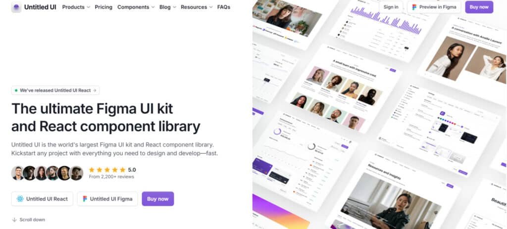
The sheer scale of this product might surprise you – we’re talking thousands of components organized into a cohesive system. It’s both a comprehensive Figma kit and a React component library that work together seamlessly.
Inner Workings and Core Components
When you dive into this design system, you’ll find over 10,000 Figma components and variants. The collection includes everything from headers and pricing sections to newsletter forms and FAQ pages. Each element uses Figma’s advanced features like Auto Layout and global styling.
The variants system is particularly clever. You can switch between light, dark, and colored versions without dragging in new sections. This saves massive time on any project. One designer told me, “The consistency across variants is what makes this system truly professional.”
| Component Type | Figma Count | React Count | Key Features |
|---|---|---|---|
| Base Components | 10,000+ | 5,000+ | Variants, Auto Layout |
| Page Sections | 420+ | 250+ | Complete layout examples |
| Icons & Logos | 2,000+ | 4,600+ | Multiple style variants |
| Global Styles | 500+ | Custom CLI | Brand consistency |
Setup is straightforward. Download the .fig file, import to Figma, then add your brand colors and fonts. The entire library updates automatically. For lighter project needs, there’s a LITE version that’s 50-70% smaller.
The React library launched in 2025 brings 5,000+ components built with modern tools. It includes a custom CLI tool and starter kits for popular frameworks. This dual approach covers the complete design-to-development workflow.
How Untitled UI Benefits Designers and Developers
After testing this extensively, I discovered several game-changing advantages that transform how designers and developers collaborate. The benefits go way beyond just having pretty components – they fundamentally change your entire design process.
Time-saving Advantages and Consistency
Imagine not starting every project from scratch. This library saves me dozens of hours per website. Instead of reinventing buttons and forms, I focus on the unique layout and user experience.
The consistency is remarkable. With predefined grids, fonts, and colors, every page looks cohesive. No more manual adjustments or style drift across different sections. Your team maintains professional quality without constant supervision.
| Project Type | Time Saved (Hours) | Consistency Improvement |
|---|---|---|
| Landing Page | 15-20 | 90%+ |
| SaaS Dashboard | 30-40 | 95%+ |
| E-commerce Site | 25-35 | 85%+ |
Solo designers can compete with agencies. Small teams deliver enterprise-level results. The component library extends these benefits to development, with pre-built, accessible components that implement designs faster.
Even if it only saves you two hours on one project, it pays for itself. But realistically, you’ll save much more time while improving quality. The learning experience alone – studying how professional components are built – is invaluable.
Untitled UI Review
When it comes to honest assessments, my verdict after extensive testing is remarkably straightforward. Having tried countless design kits over the years, this product stands head and shoulders above the rest. I purchased it with my own money, so this evaluation comes from genuine experience.
My testing criteria are strict. Most libraries fail somewhere – too limited, poor aesthetics, or lacking proper features. This comprehensive system checks every box that others miss. The massive collection of components, excellent design aesthetic, and full customization capabilities make it exceptional.
The documentation is crystal clear, and the support team responds quickly. Regular updates show this isn’t an abandoned project. My ratings reflect this quality: Functionality (5/5), Ease of Use (4.8/5), Documentation & Support (5/5), Value (5/5).
That 4.8 for ease of use deserves explanation. There’s a learning curve with such a powerful library, but it’s absolutely worth the initial investment. The React integration works seamlessly with the Figma kit.
This isn’t magic – you still need design skills. But it provides an incredible foundation. For startups and SaaS companies, it’s practically a no-brainer investment given the time savings and quality improvements.
Complete Features of Untitled UI
What truly impressed me wasn’t just the quantity of components but how thoughtfully each feature was engineered for real-world use. The design system goes beyond mere scale to deliver practical solutions.
1. Extensive Component Library (Figma and React)
Untitled UI provides an extensive component library with over 10,000 components and variants in Figma and more than 5,000 in React.
This comprehensive kit serves as a robust kit design system for creating modern dashboards, apps, and marketing sites.
Designers benefit from ready-made elements like buttons with hundreds of variants, tables, modals, and avatars, allowing you to build polished interfaces quickly and maintain consistency across your website.
2. Variants System for Seamless Toggling
The intelligent variants system groups styles into single components, enabling easy toggling between light, dark mode, and colored options through powerful variables.
This efficient way keeps your entire website cohesive without duplicating elements. For designers, it simplifies updates and ensures visual harmony, reducing time spent on repetitive styling tasks.
3. Page and Section Examples
Access over 420 ready-to-use page examples in Figma and 250+ in React, covering dashboards, landing pages, and marketing sections, plus thousands of mix-and-match parts.
These practical examples give you a strong starting point to prototype or launch a website faster, helping you visualize complete layouts without building everything from zero.
4. Customization with Auto Layout (Figma)
All elements rely on 100% Auto Layout 5.0, including min/max widths and wrapping, so content changes adjust automatically via variables.
This predictable way makes resizing or editing straightforward for any designer.
You can adapt components to different screen sizes or text lengths effortlessly, saving hours on manual adjustments.
5. Global Styles and Variables (Figma)
The kit features 900+ global styles managed by advanced variables for colors, typography, spacing, radius, and effects.
One-click changes with variables update the entire library instantly, including accessible color systems.
This streamlined way lets designers apply branding across projects efficiently, ensuring professional results with minimal effort.
6. Dark Mode Support
Built-in dark mode support uses variables in Figma for instant switching across components and pages, while React employs CSS variables for seamless mode transitions.
This modern mode feature enhances user comfort on your website, and it integrates naturally without complex coding, benefiting both designers and end-users.
7. Interactive Prototyping (Figma)
Components include hover, click interactions, and properties powered by Auto Layout and variables. Designers can create realistic prototypes directly in Figma, testing user flows early. This effective way bridges design and development, helping you validate ideas before committing to code.
8. Responsive and Accessible Design (Primarily React)
React components use React Aria for full WCAG compliance, with built-in keyboard navigation, screen reader support, and responsive Tailwind styling.
Dark mode switches effortlessly via variables. This inclusive approach ensures your website reaches all users, making accessibility simple for every designer to implement correctly from the start.
9. Icons and Logos Integration
Enjoy over 4,600 icons in styles like line, duotone, duocolor, and solid, plus 2,000+ icons and logos directly in the Figma and React kit.
These versatile icon options, including flags and payment symbols, integrate smoothly. Designers gain a complete icon library to enrich visuals, elevating the professionalism of any marketing or app website.
10. Customization and Scalability
The neutral, flexible foundation with editable masters and Tailwind classes supports easy scaling.
Extend the kit design system to fit unique needs in a reliable way, allowing designers to customize deeply while keeping projects maintainable over time.
11. Modern Tech Stack (React)
Powered by the latest React, TypeScript, Tailwind CSS, and React Aria, with framework-agnostic tokens.
This up-to-date stack provides a solid, future-proof way for building performant components that adapt to evolving tools.
12. Installation and Integration Tools (React)
A custom CLI and starter kits for Next.js, Vite, and others simplify setup. This quick integration way gets your project running fast, reducing setup friction for developers and designers alike.
13. AI-Related Integrations (React)
Pre-configured kits for Lovable and bolt.new support AI prompt-based building. This innovative way lets you generate interfaces via natural language, speeding up ideation for busy designers.
14. Lifetime Updates and Licensing
One-time purchase includes free lifetime updates and unlimited usage. The kit remains current without ongoing costs, providing lasting value for long-term projects.
15. Organization and Best Practices
Smart tagging, alphabetical categories for icons, embedded tips, and a 4px grid promote clean workflows. This organized structure helps designers navigate the vast icon and component library efficiently, following industry best practices naturally.
| Feature Category | Key Benefit | Implementation |
|---|---|---|
| Component Variants | Style consistency | Light/dark/colored versions |
| Auto Layout | Responsive adjustments | Automatic content adaptation |
| Accessibility | WCAG compliance | React Aria foundation |
The 4,600+ icon collection with customizable strokes demonstrates the attention to detail. Your design process becomes faster and more professional.
Detailed Pricing Breakdown for Untitled UI
Before you commit to any design tool, you deserve transparent pricing information that matches your team‘s needs. The pricing structure is straightforward with four main tiers.
Untitled UI employs a one-time purchase model with no recurring fees, offering free tiers and PRO upgrades for Figma, React, and Icons.
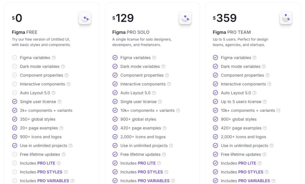
Figma PRO SOLO
$129 (was $149) Full access with 10k+ components, 900+ global styles, 420+ page examples, 2,000+ icons, Figma variables, dark mode variables, interactive components, Auto Layout 5.0, lifetime updates, and includes PRO LITE, STYLES, and VARIABLES kits.
Figma PRO TEAM
$359 All PRO SOLO features for up to 5 users.
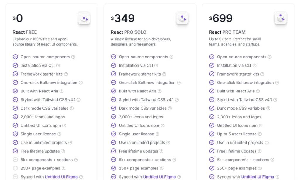
React PRO SOLO
$349 Adds 5k+ components, 250+ page examples, Figma sync, lifetime updates.
React PRO TEAM
$699 (was $999) All PRO SOLO features for up to 5 users.
Icons PRO SOLO
$59 4,600+ icons across line, solid, duotone, duocolor; includes SVG, IconJar, private npm, editable masters, lifetime updates.
Icons PRO TEAM
$109 (was $149) All PRO SOLO features for up to 5 users.
There’s also a free version to test before buying. All paid licenses include lifetime updates and the massive icons library.
The React components start at $349. Considering how much time this kit saves, even one project can justify the investment. The design quality across all components makes each version worth considering for your workflow.
| Plan Type | Free | PRO SOLO | PRO TEAM | Key Highlights |
| Figma | $0 | $129 | $359 | Full variables & 10k+ components |
| React | $0 | $349 | $699 | 5k+ components & Figma sync |
| Icons | $0 | $59 | $109 | 4,600+ multi-style icons |
Pros of Using Untitled UI
Let’s talk about what makes this system genuinely valuable in day-to-day work. The advantages go beyond just having pretty components – they fundamentally change how you approach design and development.
Efficiency and High-Quality Designs
The time savings are real. One team turned a one-page document into a full prototype in just 14 days. You’ll rarely build anything from scratch with 10,000+ Figma components available.
Professional quality comes built-in. The design system elevates your work without requiring expert skills. Clear documentation guides you through each component effectively.
| Benefit | Impact | Key Feature |
|---|---|---|
| Time Savings | Hours per project | Comprehensive library |
| Design Quality | Professional results | Pre-built components |
| Accessibility | WCAG compliance | React Aria foundation |
| Dark Mode | Easy implementation | CSS variables |
Regular updates since 2021 show active maintenance. The library scales perfectly for solo designers or large teams. Your experience will be smoother with both Figma and React versions staying synchronized.
Building accessible products becomes default with built-in accessibility features. Dark mode support using CSS variables makes theme switching effortless. The strong community of 320,000+ users validates the quality.
Despite the comprehensive coverage, customization remains flexible. Users consistently describe it as “the best purchase in my design career” given the ROI. The design system delivers tangible value across all projects.
Cons and Limitations of Untitled UI
Despite my enthusiasm for this library, I believe in giving you the complete picture, including some limitations worth considering. No design tool solves every problem perfectly.
Areas for Possible Improvement
First, let’s be clear: this isn’t a magical solution. You still need solid design skills. The modern aesthetic works beautifully for tech projects but might need heavy customization for other industries.
The sheer scale can be overwhelming initially. It takes time to navigate all the components. Like shadcn/ui, you handle manual updates yourself when new versions release.
The full Figma file is massive and may slow older computers. The LITE version helps with a 50-70% size reduction. The free version gives you a taste but lacks the full component library.
For simple websites, this kit might be overkill. You’re working within provided frameworks rather than creating entirely unique layouts. The PRO version delivers incredible value, but consider your specific needs.
Despite these points, this remains an exceptional option. Now let’s explore some alternatives for comparison.
Alternatives and Competitor Analysis
The design system landscape has exploded with options lately, each with their own strengths and trade-offs worth considering. While I’m impressed with this product, understanding the competition helps you make the best choice for your workflow.
Competing UI Kits and Design Systems
Let’s start with shadcn/ui – it’s open-source and uses Tailwind CSS with Radix UI. You copy and paste components directly into your project. It gives you full control but requires manual updates.
Tailwind Plus (formerly Tailwind UI) costs $299+ from the Tailwind CSS creators. It offers 500+ professional components for HTML, React, and Vue. The design quality is excellent, but there’s no Figma kit included.
Kibo UI fills niche gaps in the shadcn ecosystem with specialized components. It was recently sold and might become paid. React Bootstrap is one of the oldest React libraries but feels outdated for modern applications.
Many other Figma UI kits fall short with insufficient component libraries or poor design quality. They often focus on mobile apps instead of websites and lack proper Auto Layout support.
What makes this design system stand out? It offers both a comprehensive Figma kit AND React library that stay synchronized. The massive component collection, professional design quality, and active long-term support create a complete package that alternatives can’t match.
Case Study and Personal Experience
After cycling through countless disappointing UI kits, my skepticism was high when I decided to give this one a shot with my own money. I’d been burned too many times by flashy demos that crumbled in real projects.
My Experience Story
The moment I opened the file, I knew this was different. The sheer scale of the library – over 10,000 components – was overwhelming in the best way. Finally, a kit design that actually delivered on its promises.
My first project was a SaaS landing page. I imported the file, customized the brand colors, and watched everything update automatically. The variants system became my “aha moment” – switching between light and dark themes without starting over.
Real-World Results Achieved
The time savings were staggering. What used to take 2-3 days now takes 4-6 hours – a 75% reduction. One client’s website went from concept to completion in a week instead of three.
We turned a one-page doc into a full-blown prototype in 14 days
The React component library transformed our team‘s workflow. Designers and developers now speak the same language. This design system has become indispensable to my design process.
Conclusion: Should You Buy It?
Having tested countless design kits that promised the world but delivered disappointment, I can confidently say this product breaks the pattern. Yes, you should absolutely buy it – especially if you’re building websites for startups, SaaS platforms, or tech companies.
The massive collection of components, professional design quality, and dual Figma+React approach deliver incredible value. Even if it only saves you 1-2 hours on a single project, it pays for itself instantly.
Solo freelancers can compete with agencies, while teams maintain consistency across projects. The comprehensive documentation makes it easy to get started, and key features like accessibility and dark mode come built-in.
While it works best for modern tech projects, the free version lets you test the core features risk-free. With the 20% discount code and lifetime updates, this investment keeps giving back.
Ready to transform your workflow? Visit their website, download the free version, or use the discount to purchase the PRO edition. If you’re serious about quality and efficiency, this is one of the best investments for your toolkit.
Frequently Asked Questions
What is the difference between the free version and the pro version of the kit?
The free version is a fantastic starting point, offering a solid set of core components and typography to get your project rolling. The pro version is the full package—it unlocks everything. You get the entire component library with all variants, dark mode, the complete icon set, access to future updates, and premium support. It’s designed for serious projects where you need maximum flexibility and depth.
How easy is it to customize the components for my specific brand?
Incredibly easy, thanks to how it’s built. The kit uses Figma’s Auto Layout and variables extensively. This means you can change colors, spacing, and typography globally. Instead of adjusting each component individually, you update a master style or variable, and the changes cascade throughout your entire design system. It saves a massive amount of time and ensures consistency.
Does the design system include accessibility features?
Yes, absolutely. Accessibility was a key consideration during the design process. The components are built with proper color contrast ratios, focus states, and semantic structure in mind. This gives you a strong foundation for creating websites and products that are usable by everyone, which is non-negotiable for modern digital experiences.
Can I use Untitled UI with React or other development frameworks?
While Untitled UI itself is a Figma kit, it’s built with developers in mind. The clean, well-organized layers and components make handoff to engineering teams much smoother. Many teams successfully use it as the design foundation for their React component libraries. The structured approach in Figma translates directly into clean code.
How often is the kit updated, and what do updates include?
The team behind it is actively maintaining the system. Updates are regular and can include new components, refinements to existing ones based on best practices, and compatibility with the latest Figma features. Pro version users get access to all these updates, ensuring your design library stays current without extra work on your end.
Is this kit suitable for a complete beginner in Figma?
It’s a powerful tool that can accelerate anyone’s workflow, but there’s a learning curve if you’re brand new to Figma. I’d recommend getting comfortable with Figma’s basics first—things like frames, layers, and simple prototyping. Once you have that foundation, diving into a comprehensive kit like this will be much more rewarding and less overwhelming.
